Generating spectrograms the hard way with numpy.
A spectrogram is a convenient visualization of the frequencies present in an audio clip. Generating one involves obtaining the frequency components of each window of the audio via a Discrete Fourier Transform (DFT) of its waveform. While tools are available to both generate spectrograms and compute DFTs, I thought it would be fun to implement both myself in my language of choice, Python.
In the following, I will discuss computing a DFT (the hard way), processing a WAV file, and rendering a spectrogram (all in Python). If you’re impatient and just want to see the code, you can find it on GitHub.
The Discrete Fourier Transform.
A Fourier Transform converts a signal from the time domain (i.e., a waveform) to the frequency domain, wherein peaks represent dominant frequencies in the signal. The Discrete Fourier Transform (DFT) is the finite-resolution version of the Fourier Transform that we use for sampled signals such as audio clips.
Usually, the DFT is computed using an algorithm called the Fast Fourier Transform (FFT). However, the naive computation of the DFT just involves multiplying a vector of samples with what is known as the DFT matrix.
The values of the DFT matrix are the same for each given size of sample vector. One may refer to the relevant Wikipedia article for examples of the 2-element, 4-element, and 8-element DFT matrices. Each is computable through a general formula. To create a DFT matrix, simply assign each element of the matrix the value $\omega^{jk}$, where $j, k$ are the element indices. The $\omega$ itself is a constant determined by the vector size $N$: $\omega = e^{-2i\pi/N}$.
It turns out that this type of matrix, where a constant is raised to a power depending on its index, is called a Vandermonde matrix. Fortunately, numpy gives us a useful method for computing such matrices. Therefore, in Python, we may simply compute the value of $\omega$:
w = np.exp(-2j * np.pi / N)
And then create a Vandermonde “matrix” which is really just a column vector:
col = np.vander([w], N, True)
And finally build the complete Vandermonde matrix using that column:
W = np.vander(col.flatten(), N, True)
To perform a DFT, we simply compute the dot product between this matrix $W$ and our vector $V$. Putting it all together, we have a very simple function:
def matrix_dft(V):
    N = len(V)
    w = np.exp(-2j * np.pi / N)
    col = np.vander([w], N, True)
    W = np.vander(col.flatten(), N, True) / np.sqrt(N)
    return np.dot(W, V)
Note that we scale by the term $1/\sqrt{N}$, as is conventional.
Catching a WAV.
WAV files are simple, and seemingly timeless. They’re the most simple format for storing uncompressed audio. Python ships with a library for parsing them, so they will be quite convenient for the task at hand.
First, we must open the file and determine important parameters such as the sample rate, number of channels, sample width, and number of frames.
w = wave.open(input_file, 'r')

sample_rate  = w.getframerate()
num_channels = w.getnchannels()
sample_width = w.getsampwidth()
num_frames   = w.getnframes()
When we ask to read a frame of audio, it will be given to us in raw form. Therefore, we need to know the sample width and number of channels in order to make sense of it.
x = w.readframes(1)
x = np.fromstring(x, dtype=np.int8 if sample_width == 1 else np.int16)
x = np.reshape(x, (1, num_channels))
We begin by reading the raw frame. This gives us an array of bytes. We pass it to numpy’s fromstring function, which will convert it to an array for us. Note that we must specify the datatype as int8 if the sample width is one byte (8 bits), or int16 if the sample width is two bytes (16 bits). Then, we reshape the array into a matrix wherein the channels are separated.
This single audio sample isn’t incredibly useful, so we can also request a window of some number of samples and process it the same way:
window_size = 1024
x = w.readframes(window_size)
x = np.fromstring(x, dtype=np.int8 if sample_width == 1 else np.int16)
x = np.reshape(x, (window_size, num_channels))
This will be quite necessary shortly, when we begin computing DFTs in order to generate our spectrogram.
Transforming the Window.
Once we have our window of audio, we can do some magic to it to get spectrum data out. If the audio is stereo, we will first mix down to mono before we run a DFT. Then, we must perform some postprocessing to make that output useful.
if num_channels > 1:
    x = (x[:,0] + x[:,1]) / 2
else:
    x = x[:,0]

y = np.fft.rfft(x)
y = y[:window_size/2]
y = np.absolute(y) * 2.0 / window_size
y = y / np.power(2.0, 8*sample_width - 1)
y = (20 * np.log10(y)).clip(-120)
To mix together the two channels, we simple take their average. Note that instead of using the DFT function we implemented earlier, we simply called the FFT provided by numpy because it is way faster.
You may be surprised to see that we have discarded half of the output. This is because the DFT result is symmetric, and thus the second half is redundant and we won’t need it. You may have noticed earlier that the DFT matrix itself is symmetric across its diagonal – that explains this result.
Next, we take the absolute magnitude of the DFT, which gives us a real-valued magnitude. We scale by a factor of 2 because we originally discarded half of the spectrum, then divide by the window size to give us a value of magnitude per sample. We divide again by the value $2^{8s-1}$, where $s$ is the sample width, to give us an intensity relative to the maximum intensity possible with a sample of that size (recall that $s$ bytes equals $8s$ bits, and samples are signed integers). Finally, we compute $20log_{10}(y)$ to convert to decibels (dB) and filter out values below -120 dB.
Now, we have successfully computed the spectral content of a single window of audio. We may perform the above computation in a loop in order to generate spectra for each frame. In my implementation, I appended each of the above results y to a list Y. By combining all of these frames, we can produce a spectrogram.
Plotting the Spectrum.
I chose to use matplotlib to visualize my data, since it is the plotting system most familiar to me.
It turns out, the first thing we must do is transpose the list Y. By default, numpy treats each subsequent input y as a row, rather than a column (as we want for the purpose of a spectrogram).
Y = np.array(Y).transpose()
For quick-and-dirty validation purposes, we can visualize this using the imshow function.
plt.imshow(Y)
plt.show()
The result for a 440-Hz sine wave looks like this:
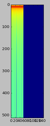
It looks pretty good, but there are a couple problems. First, the frequencies are plotted upside down. Then, notice that our axis labels are simply pixel coordinates. While there are hacks to fix both of these, it will be much easier to use the pcolormesh function instead. However, this requires us to first generate arrays for our time and frequency coordinates, which we will use as our x and y coordinates when plotting.
t = np.arange(0, len(Y), dtype=np.float) * window_size / sample_rate
f = np.arange(0, window_size / 2, dtype=np.float) * sample_rate / window_size
For the time coordinates, we start with an array of indices of each of our window spectra in Y. Then, we multiply by the window size (number of samples per window) and divide by the sample rate (number of samples per second). The result is the time coordinate, in seconds, for each window.
The frequency coordinates are generated similarly. We start with the indices of our window\_size / 2 frequency values, then multiply by the sample rate and divide by the window size. This is because the spacing of frequencies returned by the DFT is given by $f/N$, where $f$ is the sample rate and $N$ is the window size.
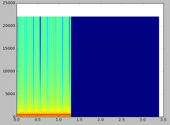
Having generated our coordinate arrays, we can finally call pcolormesh. Note that we specify a range of -120 dB to 0 dB for the colormap.
plt.pcolormesh(t, f, Y, vmin=-120, vmax=0)
The result is still not that pretty, however at least now everything is right-side up and our axes are numbered appropriately.
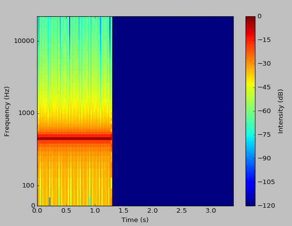
To complete the presentation of our spectrogram, we only have a few more changes to make. We will use a ‘symlog’ scale (which is logarithmic above a certain threshold, and linear below it), set our axes limits, label the axes, and display a colorbar.
plt.yscale('symlog', linthreshy=100, linscaley=0.25)
ax.yaxis.set_major_formatter(matplotlib.ticker.ScalarFormatter())

plt.xlim(0, t[-1])
plt.ylim(0, f[-1])

plt.xlabel("Time (s)")
plt.ylabel("Frequency (Hz)")

cbar = plt.colorbar()
cbar.set_label("Intensity (dB)")
The result is now quite acceptable.
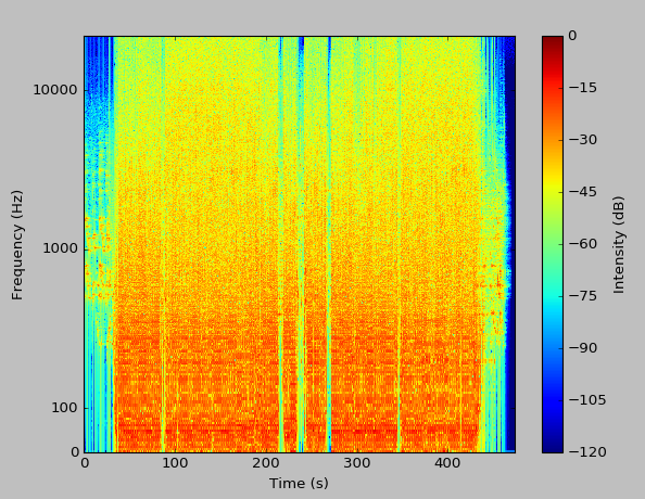
We can even run an analysis on an entire song.
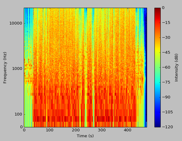
There we have it, a fully-functional spectrogram tool.
Completing the Package.
To make things a bit more useful, I added a progress bar while the DFTs are being calculated, and added an option to change the window size at runtime. With larger windows, you will notice much better resolution in the output.
As previously mentioned, the complete source is available in GitHub. While it isn’t incredibly useful for real applications, this was quite a fun project, especially considering that I had no prior background in practical signals analysis. For real-world applications, you might want to consider matplotlib’s builtin spectrogram capabilities, or a standalone tool such as Spek.
slug: numpy-spectrogram
Update: Window Function.
I was given a suggestion to implement a smooth (rather than rectangular) window function, and after reading this guide I found that it was quite straightforward. The calculation of the Hann window function was a one-liner:
hann = 0.5 - 0.5 * np.cos(2.0 * np.pi * (np.arange(window_size)) / window_size)
I then multiplied these coefficients against the audio window before feeding it to the FFT. Because the window is tapered, I also had to implement a running window with 4x overlap in order to cover the full signal. The result has significantly less spectral leakage.
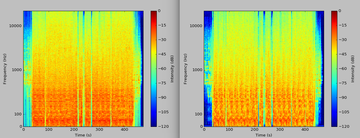
The plot on the left has a rectangular window, and the plot on the right has the Hann window. It is visibly more crisp. As always, the full updated code is on GitHub.